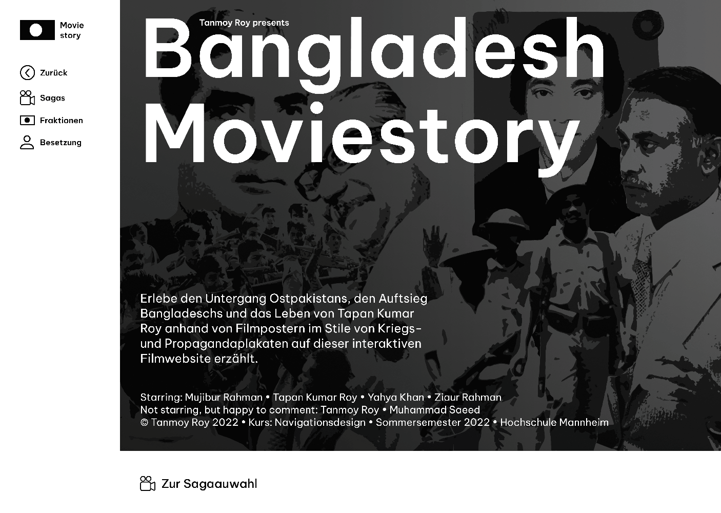
Bangladesh Moviestory
Project language
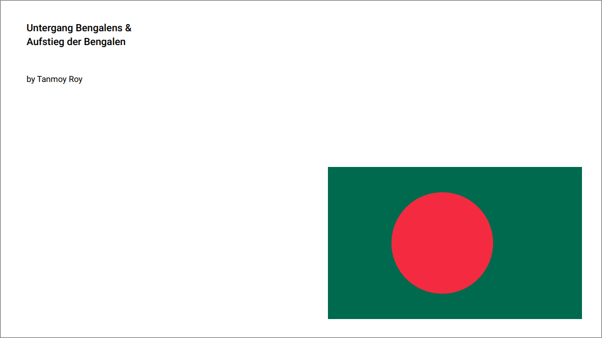
german
Client
university project
Year
05.2022 – 07.2022
In a nutshell
Bangladesh Moviestory is a movie website that tells through movie posters not only the history of the downfall of East Pakistan and the rise of Bangladesh, but it also functions as a small biography of my father, Tapan Kumar Roy, who lived through all of this. Every poster is based on war and propaganda posters.
Task
Create an innovative and interactive project that let you experience the downfall of a power of the past. It should be surprising, layered, have different views and present information in an exciting way.
Process
Analysis and research
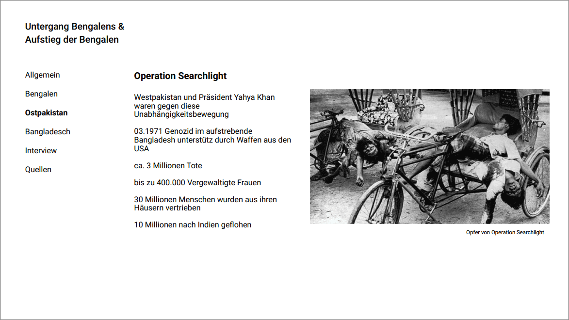
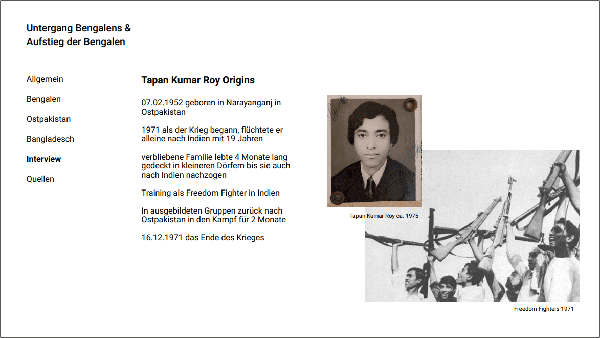
Foremost, we had to create a short presentation about our chosen topic in order to understand the whole scope of the downfall.
Then we had to plan out our navigation concept and other aspects like what powers we want to portray and how we want to represent them.
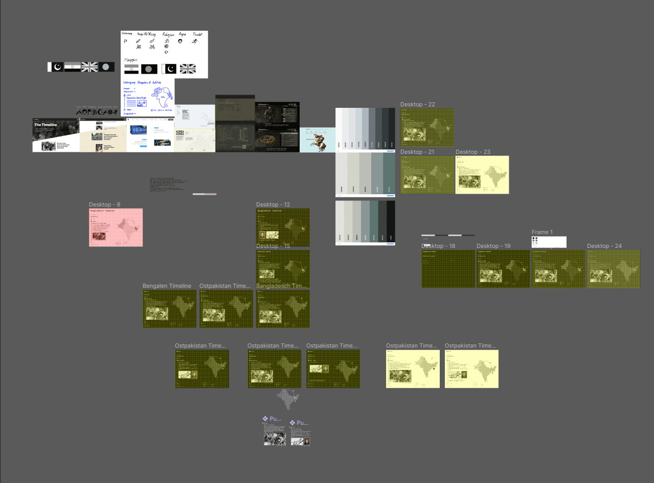
Scrapped Idea
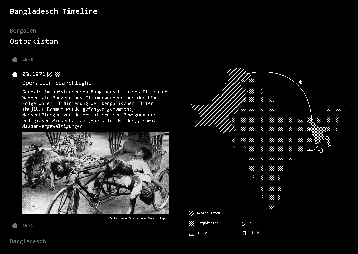
My first idea was a timeline of the occurring events with a map that showed the involved countries and interactions with little icons in a minimalistic dark look.
Even though I liked the aesthetic, I wasn't happy with this concept. The website wasn't really that interactive and the personal story of my father couldn't really come out. That's why I made a restart.
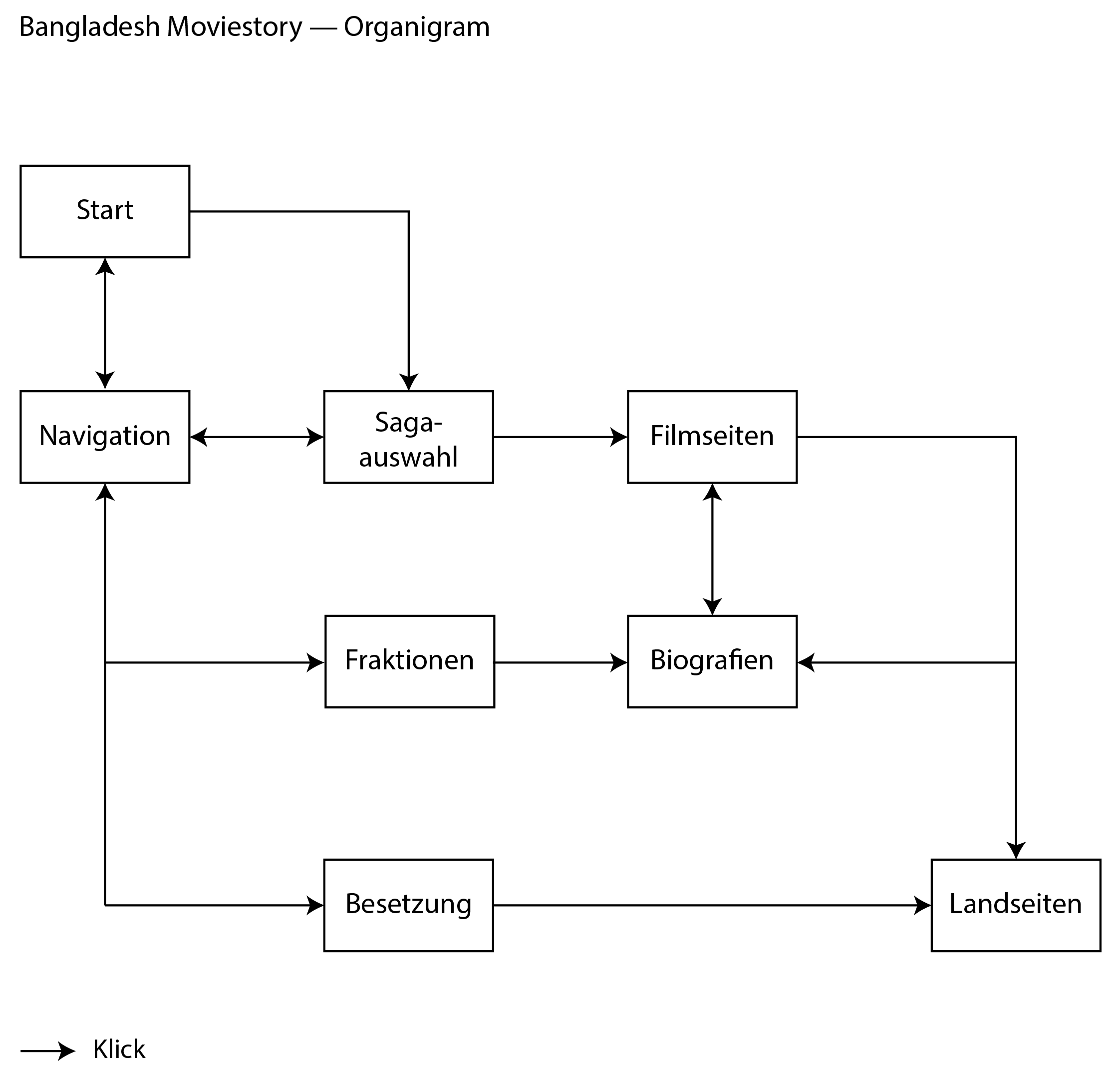
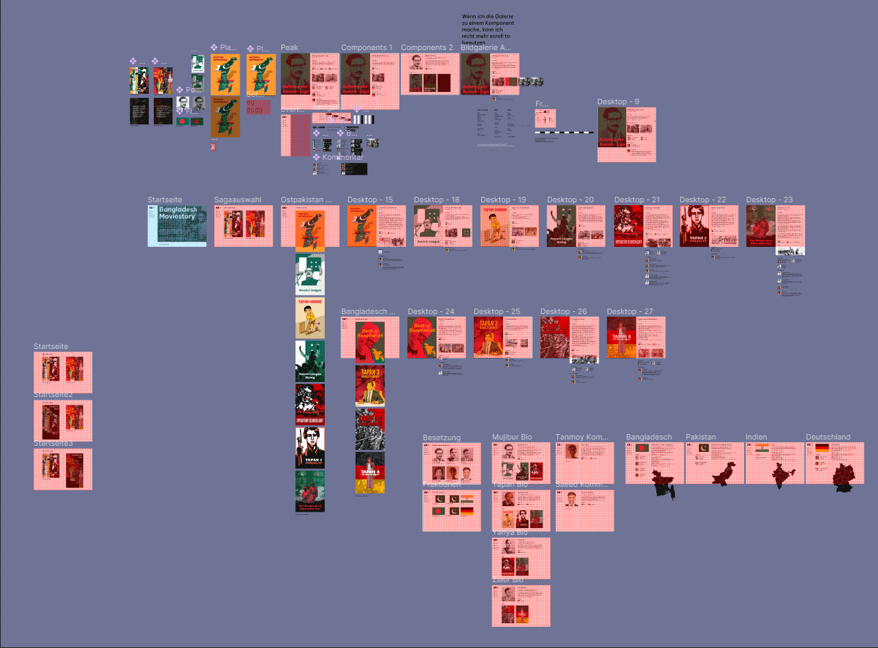
Organisation Chart
To have a visual overview of my new concept I created an organization chart.
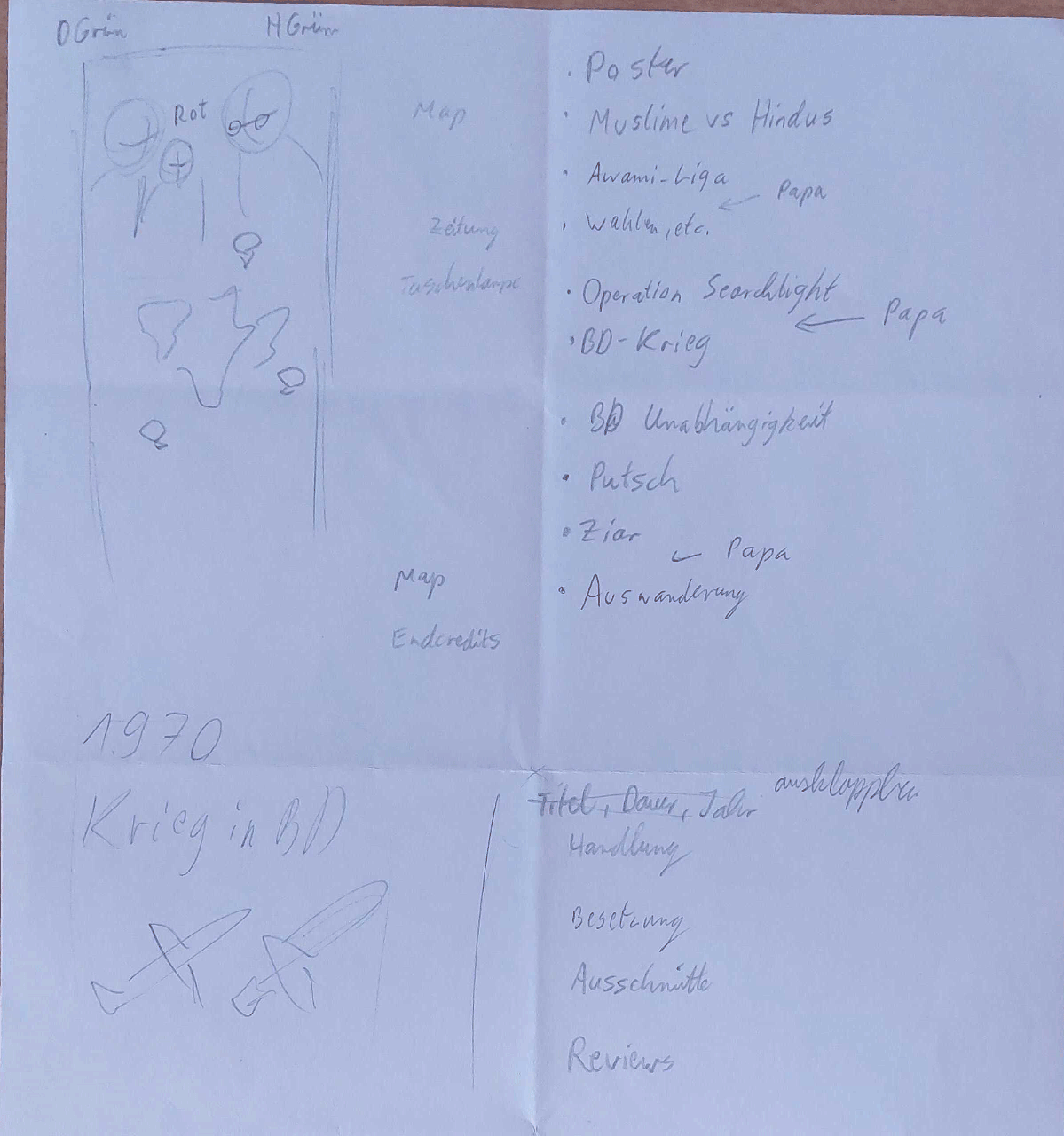
Design Sketches
The first sketches of the website portrayed all events in a long movie poster that you could continuously scroll through, with maps and icons littered in between.
The long poster was scrapped in favor of several posters for each event. The maps in between got reused in faction sites to show the specific country. Icons got scrapped completely because the story descriptions of the movies have the same purpose.
Prototyping
The design process started out with prototyping in Figma. The overall design is kept in a simple but still easy to understand black and white look that doesn't distract from the posters.
All interactive elements change into a dark mode after hovering, to ensure that even Internet newbies understand what things you can click on. These are also rounded to distinguish themselves from the angular non-interactive elements.
After clicking on an element, you'll be led to an appropriate page. Elements like factions, cast and comments connect most pages and have their own overview pages. This connectivity leads to a free click-through and exploring of this website.
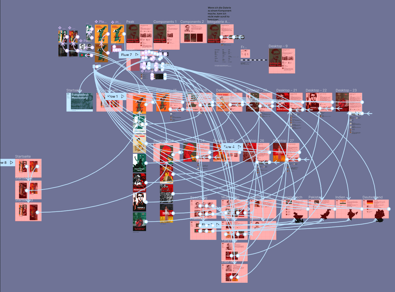
Usability Tests
After a usability test with my father who rarely uses computers, I came to the conclusion, my page needs an even easier way to understand the navigation.
Before, it relied on a back button that shows other navigation options after hovering over it. But hiding away these options with only the symbol of the back button visible just confused my test subject.
In the end, I settled for a permanent side navigation on the left that slides in on movie pages after hovering over the poster.
Result
Retrospective
The biggest thing I’ve learned through this project is that you shouldn't just go with the first idea that comes to mind. You have to think about innovation and exciting experiences. To have a convincing idea that not only the user, but also you are satisfied with, is very important.