
Context
master thesis
Date
05.2025 – 11.2025
What I did
UX design, UI design, UX research, brand design, branding, website building, illustrations, graphic design and a lot more
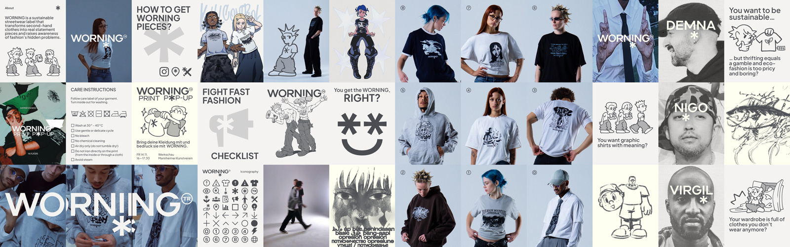
Jump to websiteFor my master thesis I have created my own fashion brand including the branding, the collection and the accompanying website. WORNING is a sustainable streetwear label that prints critical messages on secondhand garments to raise awareness about issues within the fashion industry. The accompanying website provides essential context by decoding the prints, explaining industry problems, and showing ways to take action. Together, they form a wearable awareness campaign that gives sustainable fashion and activism a modern, appealing twist. This case study dives into the conception of the branding as well as the website showcasing my brand design, graphic design and UX/UI design skills.
The fast-fashion industry is responsible for numerous social and environmental issues. Yet many consumers are unaware of these problems or choose to ignore them because low prices and fast-changing trends are too tempting. Sustainable alternatives are often financially out of reach and secondhand shopping makes it difficult to find specific items. As a result, awareness remains low and conscious consumption is not widely practiced.
WORNING aims to expose the injustices of the fashion industry, promote conscious consumption and redefine sustainability in an accessible, aesthetic and provocative way. The more WORNING appears on the streets, the more people become curious, discover the brand and understand its message. By printing critical designs on secondhand clothing, it offers a real alternative to expensive eco-fashion and time-consuming thrifting while setting an example for new, sustainable business models in the fashion industry.
To establish the foundation for defining the WORNING brand and the requirements for the accompanying website, I conducted extensive research. I started out with a deep dive into relevant topics. These included fast fashion, sustainable fashion, graphic shirts, marketing strategy and print methods.
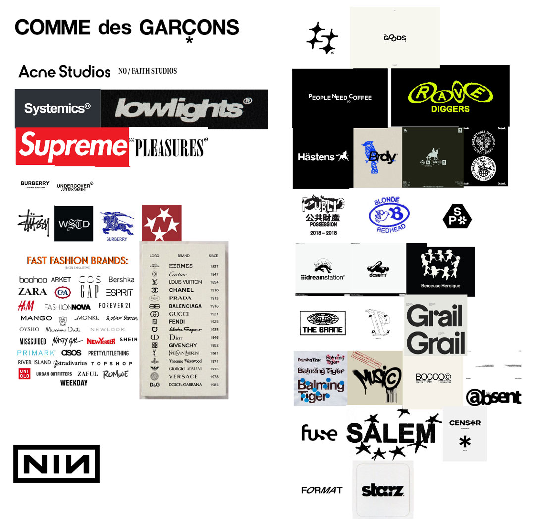
To gain an overview, I analyzed brands with similar concepts to mine. Conclusion: There are brands that specialize in printing on clothing, upcycling, or socially critical messaging but none that combine and present these elements in the way I envisioned for WORNING.

To gain insights into the target audience, I first conducted a short survey to better understand consumption habits and style preferences. Additionally, I launched an open call for favorite graphic motif submissions.
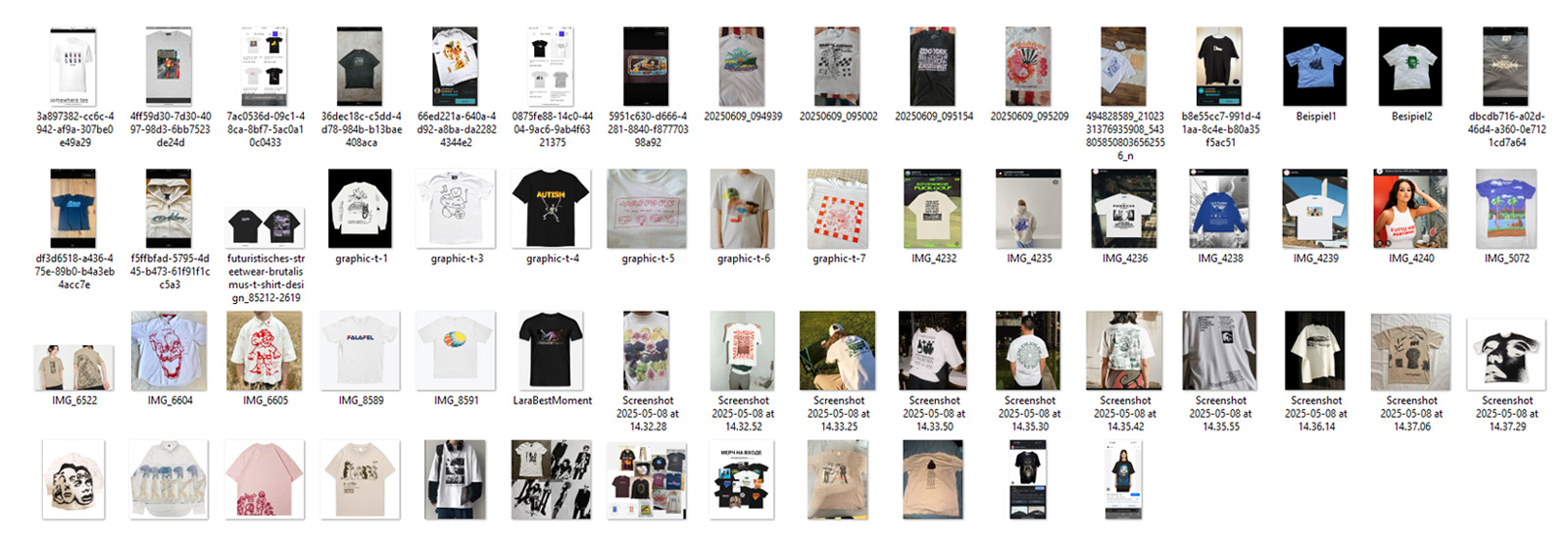
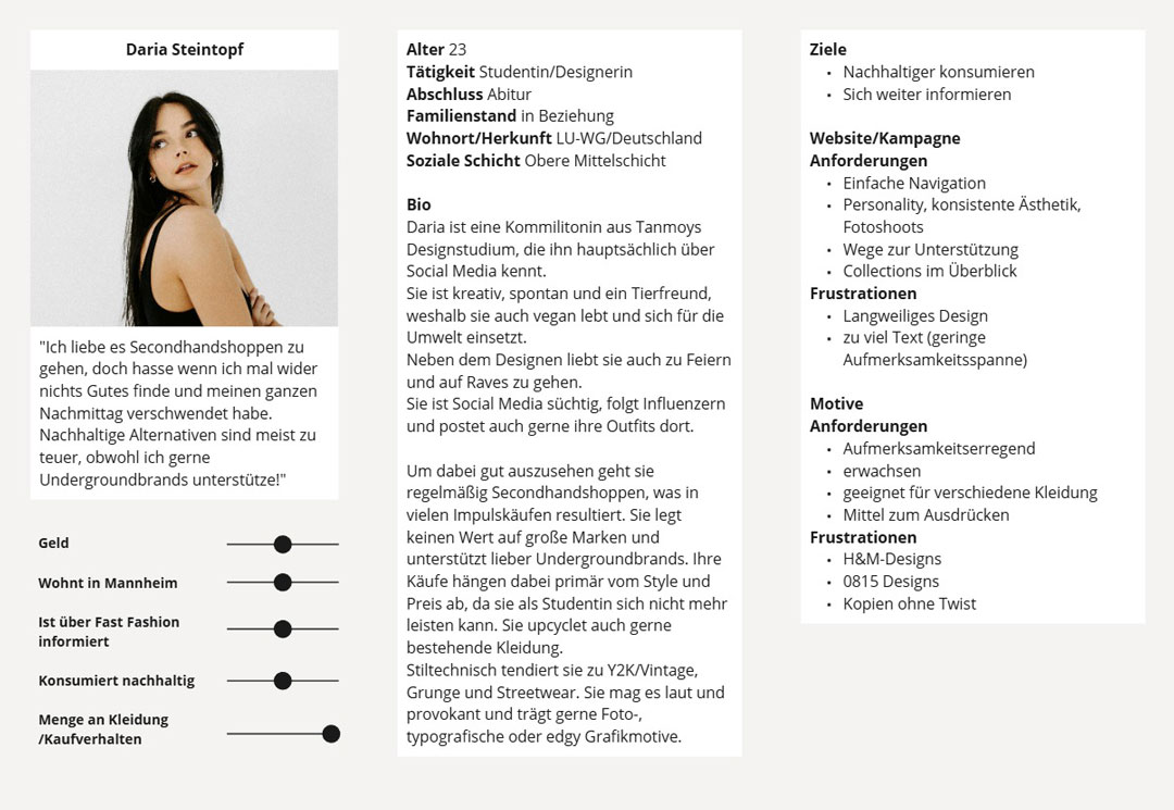
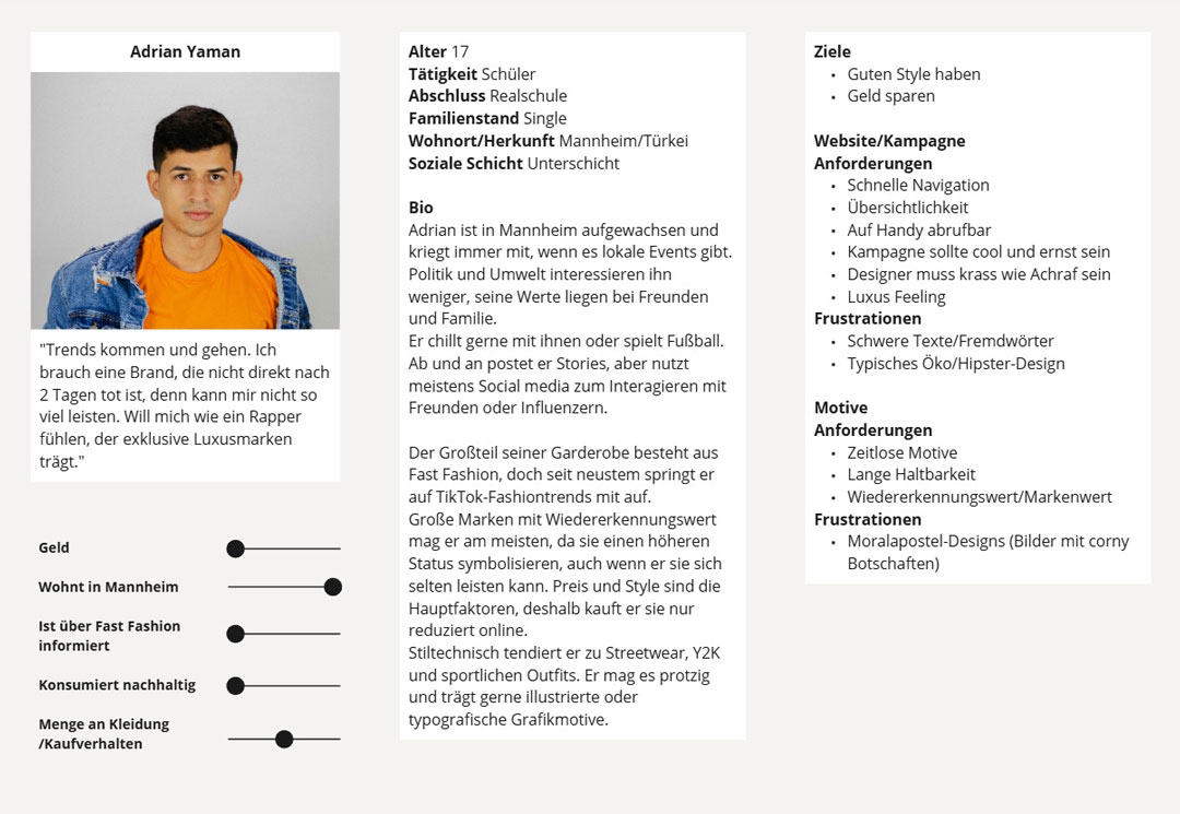
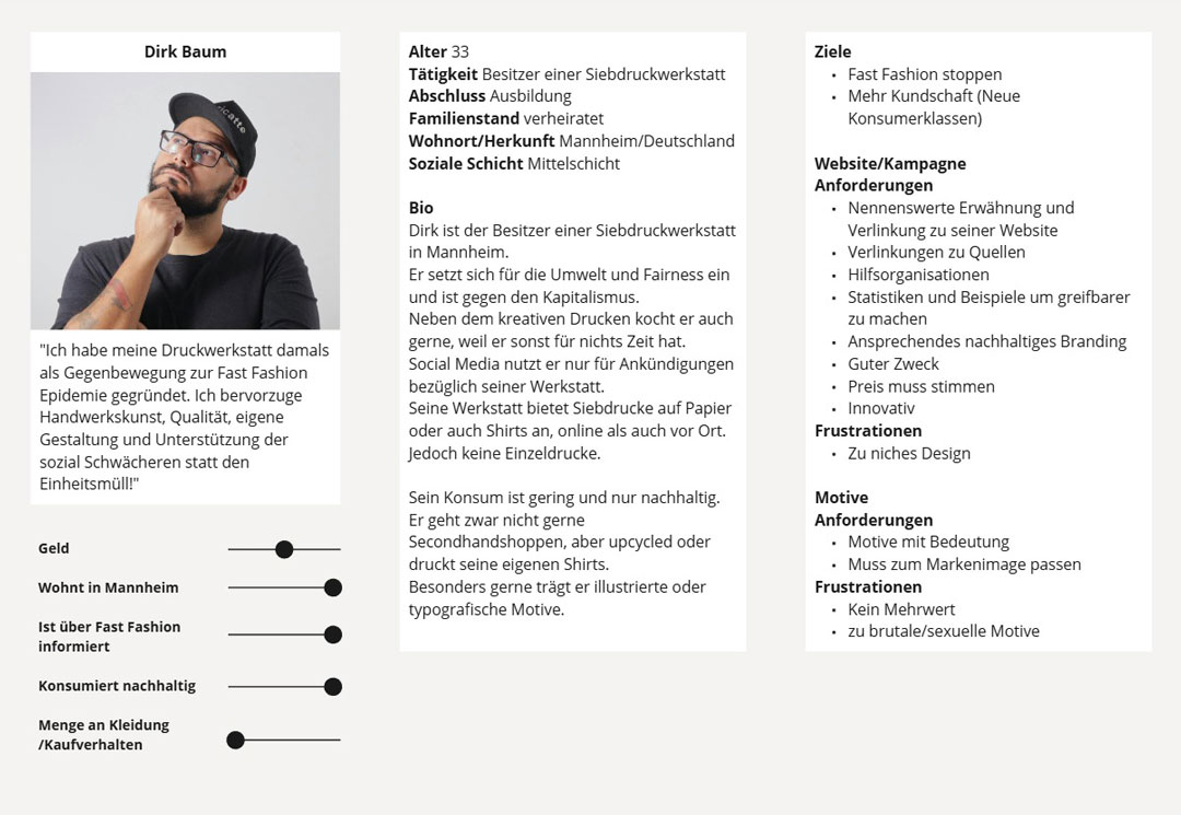
As a last step I developed four distinct personas, each with different backgrounds, values, motivations, pain points and goals. They will be helpful for the user story mapping process.
After completing most of the research, I defined WORNING’s brand purpose, identity, positioning, personality, story, and strategy in a brand manifesto.
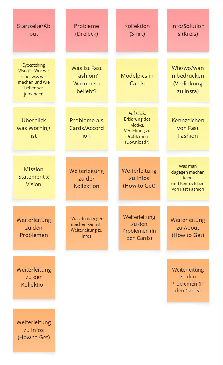
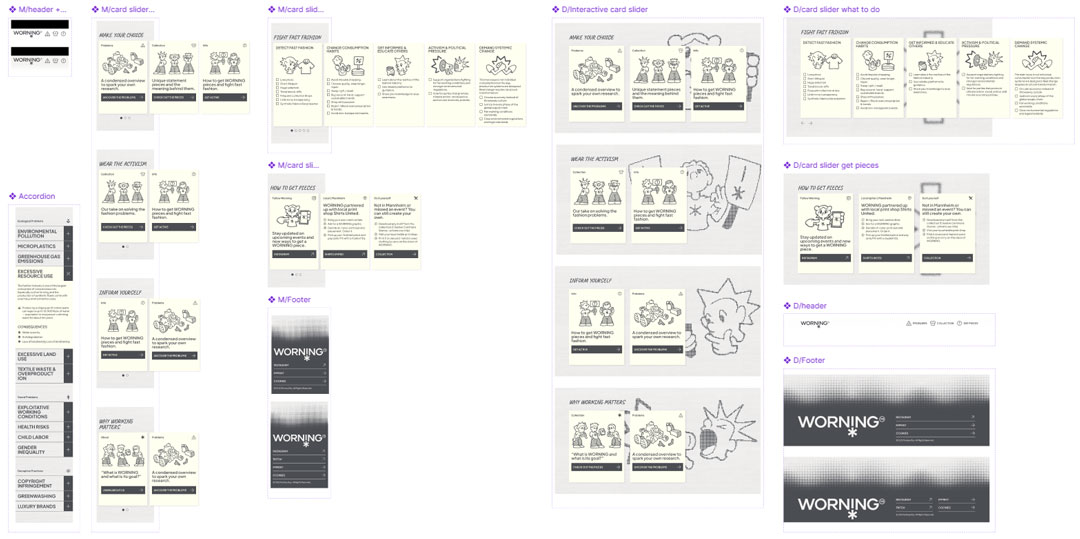
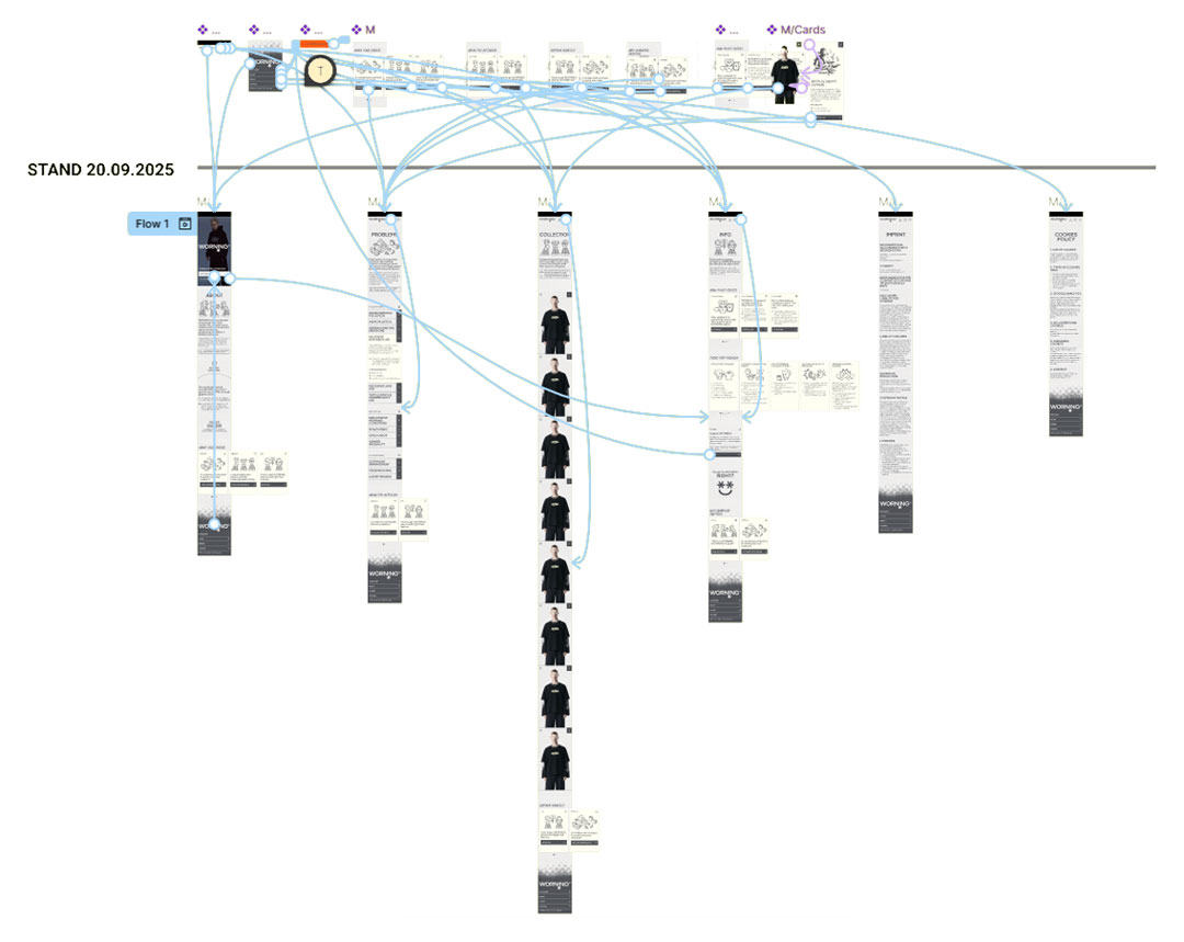
Based on the insights gained from the personae and my own requirements, I created an overview of all necessary functions and content, which I grouped into logically connected pages. I then developed an information architecture that illustrates the hierarchy and connections between the pages.
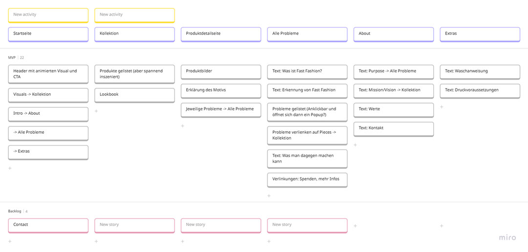
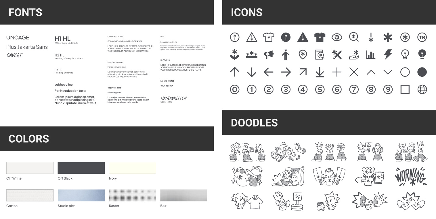
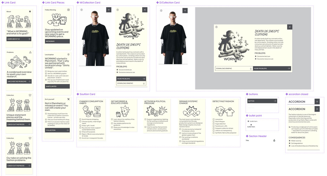
To streamline the design process, I implemented a design system following the principles of Atomic Design. In this approach, components are divided into atoms, consisting of individual elements such as fonts or icons. Multiple atoms form molecules, such as buttons or cards. A combination of molecules creates organisms, for example, headers or general sections. Ultimately, these organisms collectively form the individual pages.
Throughout the process, I presented my design progress to other designers multiple times, tested functionality, gathered feedback and refined the design accordingly. In total, I documented around nine feedback loops.
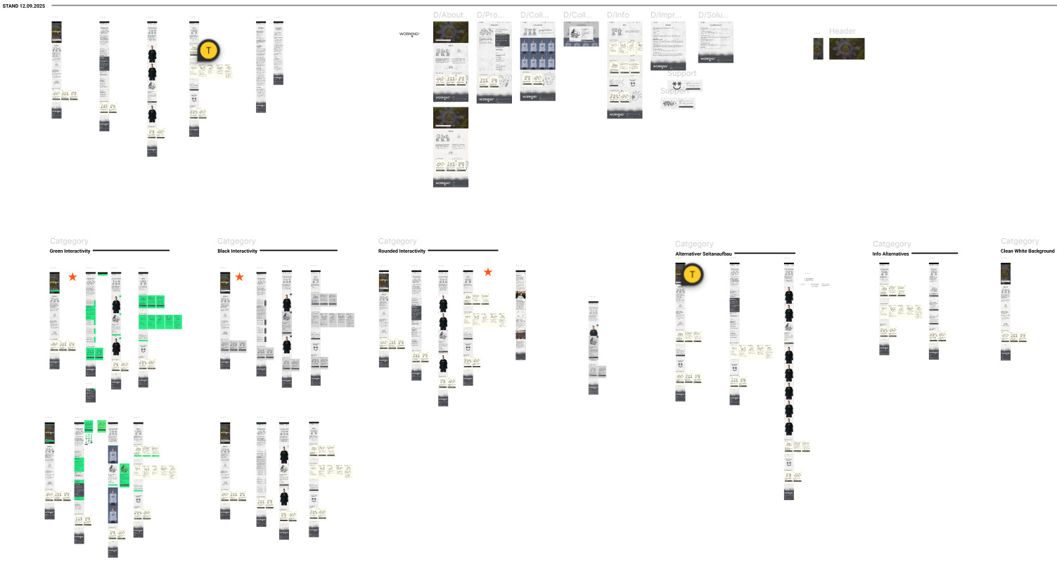
Next, I built a prototype of the mobile version to test the design, user experience and functionality before beginning development. For the usability tests, I had participants navigate it and complete various tasks. I documented both encountered issues, thoughts or reactions. Afterwards, I adjusted the prototype based on the findings and had the revised version tested by additional participants. In total, I conducted three rounds of testing. This resulted into all interactive elements appearing in bold black or white boxes, while movable and collapsible components use ivory.
The website needed to be accessible during promotions and active campaigns for the entire WORNING concept to work. That’s why I opted to recreate it using a website builder. I chose Webstudio. It took some time to understand all the features and get familiar with the system. Despite the simplified “designer interface,” I still had to write custom code to achieve many of the functionalities I wanted.
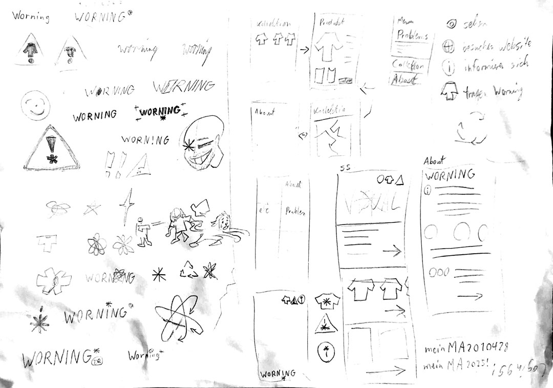
To form an initial vision for design and functionality, I sketched page elements, layouts, icons, and illustrations, essentially a visual brainstorming session. I created extensive moodboards for the logo, general design direction, graphic motifs and the photoshoot to gather inspiration.
I intentionally moved away from the typical sustainable branding aesthetic of plants, greens, and wood textures. This look often feels predictable and uninspiring. My goal was to redefine sustainability in a way that is modern, appealing, and free from clichés.
Logo
The name WORNING combines worn (used, aged) and warning, meaning “a worn warning.” Worn reflects the second-hand nature of the clothing; warning highlights the brand’s critical stance toward the fashion industry. The logo is minimalist and high-fashion–inspired, but the oversized asterisk disrupts the elegance, adding a distinctive, rebellious identity. A copyright symbol built from my initials references classic streetwear culture. Since the logo appears alongside bold print designs, it acts more like a signature: simple, readable and easy to recognize.
Design Concept
The composition of the name shapes the entire corporate design: Warning reflects the informative, industrial character of the brand. Worn represents distressed textures, gritty visuals, and streetwear/punk-inspired doodles. The overall look is inspired by care labels and receipts. Care labels reveal what clothing is made of. Receipts expose the real “price” we pay for fashion. Both perfectly reflect WORNING’s mission: revealing what lies behind the fashion industry.
Fonts
The primary typeface references label typography, while a handwritten accent font mimics doodling on a tag.
Colors & Textures
The palette is clean and monochrome in off-white tones. Various textures add depth and tactile character throughout the design.
Icons
I designed around 74 custom icons following the Micro Graphics language, with many incorporating an asterisk, a recurring element throughout the branding.
Doodles
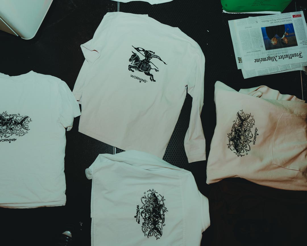
In addition to the print artwork, I created 15 standalone illustrations specifically for the website. These illustrations depict small characters in a distinct artistic style: the “Lil Punks,” WORNING’s mascots. They embody the creative spirit of the brand and visually communicate its message. Their look is rooted in the punk movement of the 70s and 80s an era defined by torn fabrics, DIY graphics, and rebellion against consumerism and conformity. This spirit is at the core of WORNING.
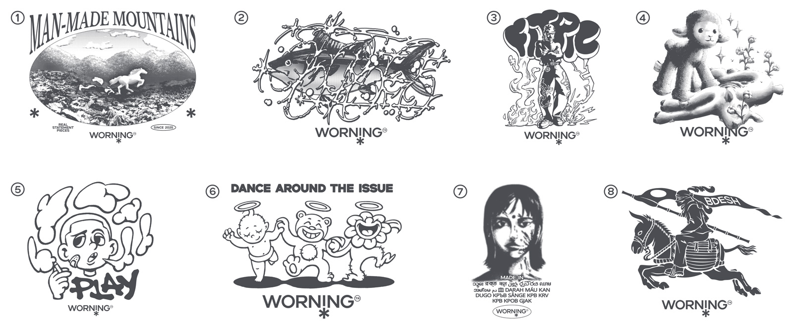
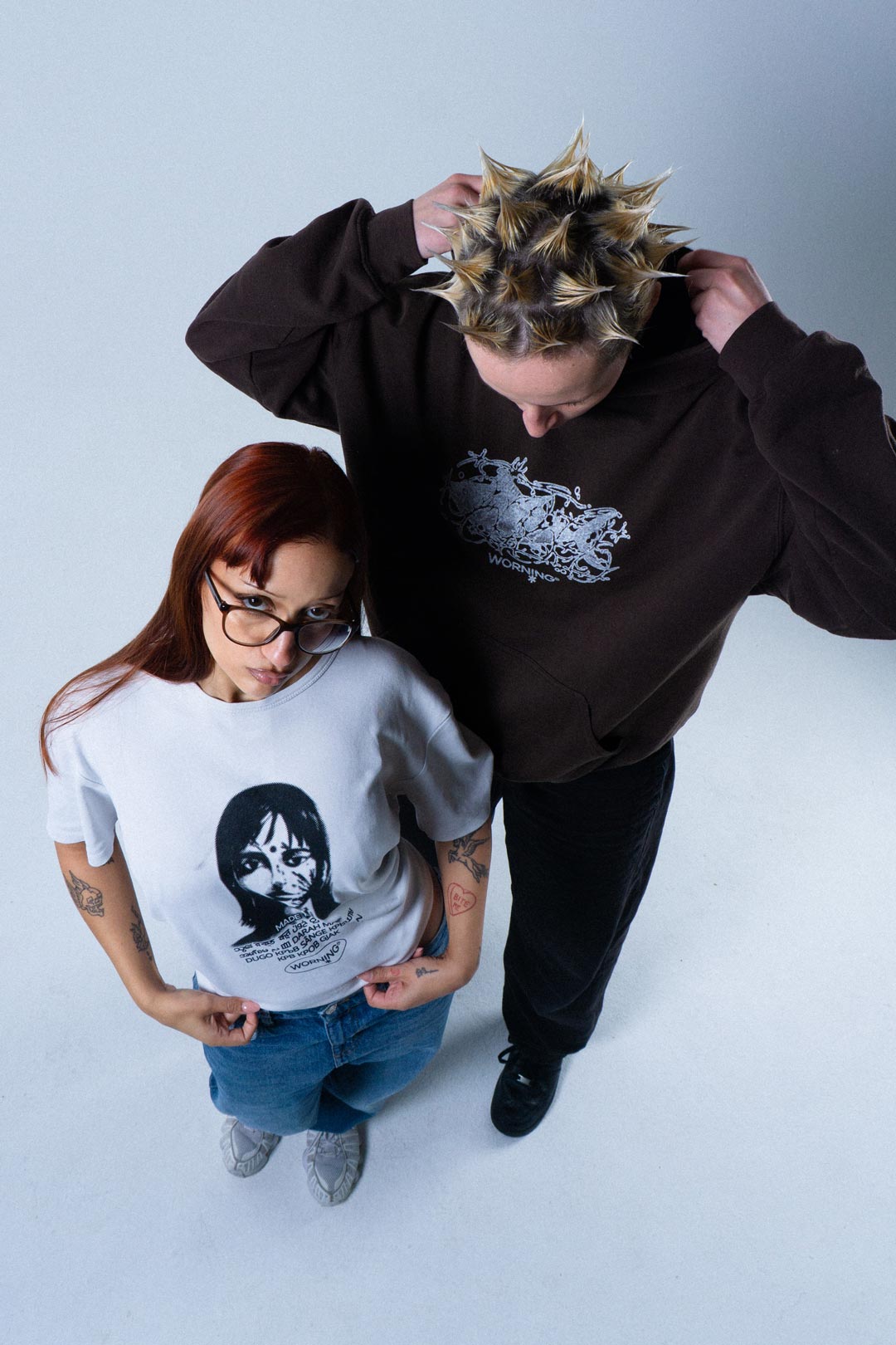
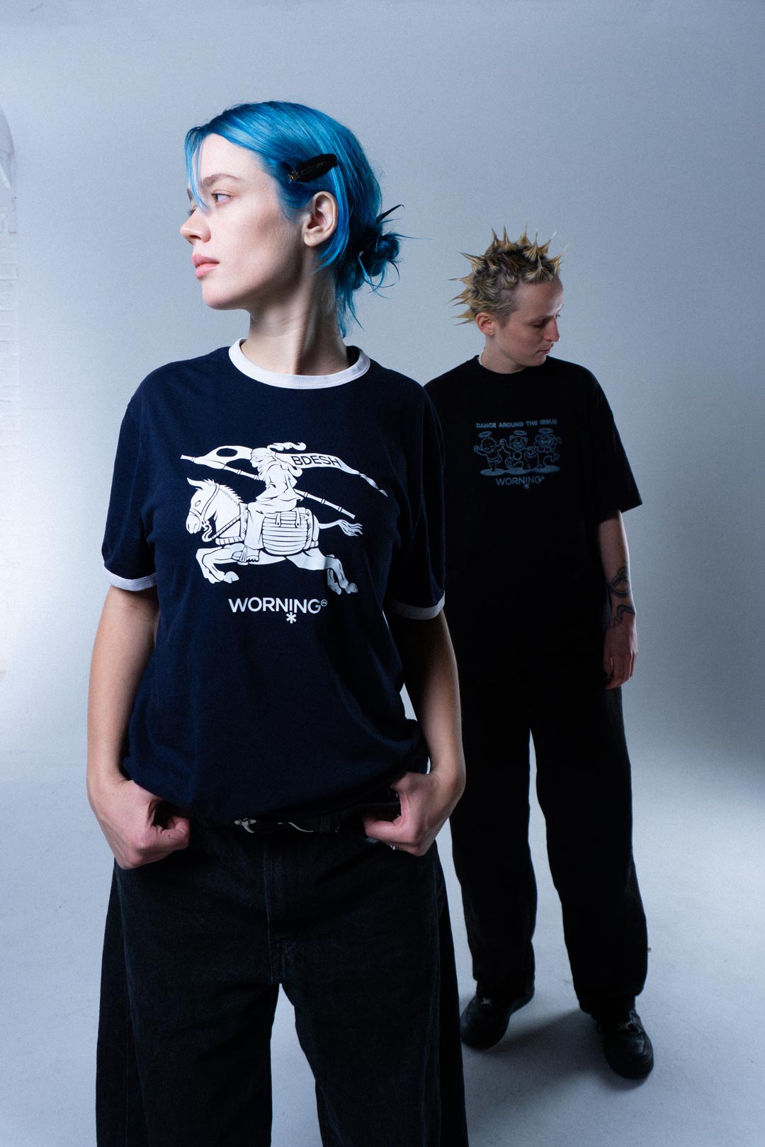
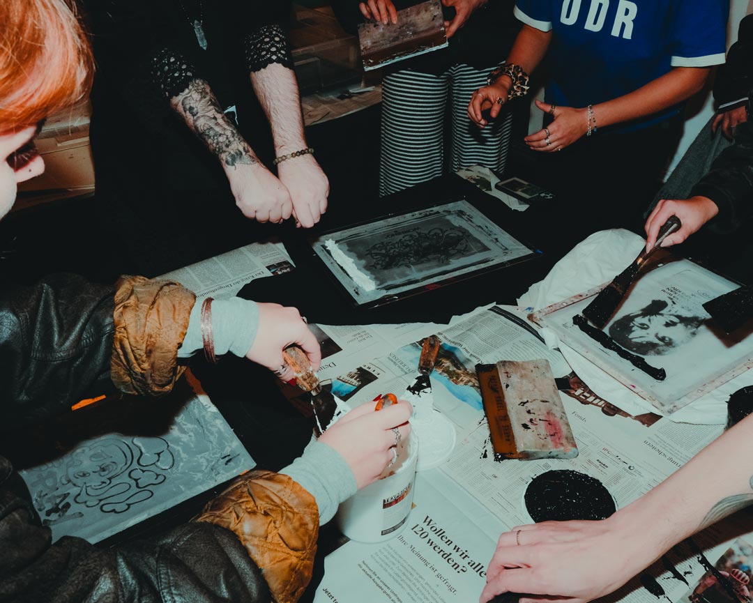
I created eight designs across different art styles, each loaded with meaning. By using a variety of styles—from realism to my manga style, I aimed to appeal to as many aesthetic preferences as possible.The motifs are cryptic, edgy, and carry a dark undertone. Their subtle messaging ensures everyday wearability, while still raising enough questions to push curious viewers toward the website for deeper context. Considering motif size and contrast, I ultimately produced eight screens and hand-printed all garments for the photoshoot using screen printing.
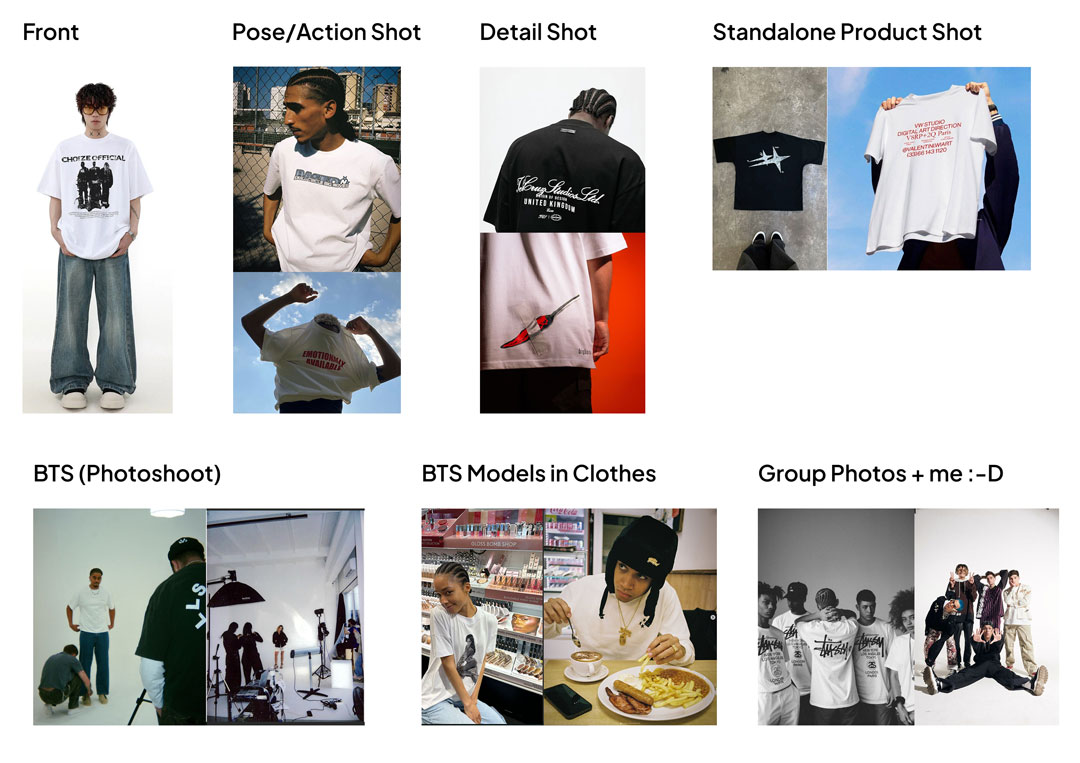
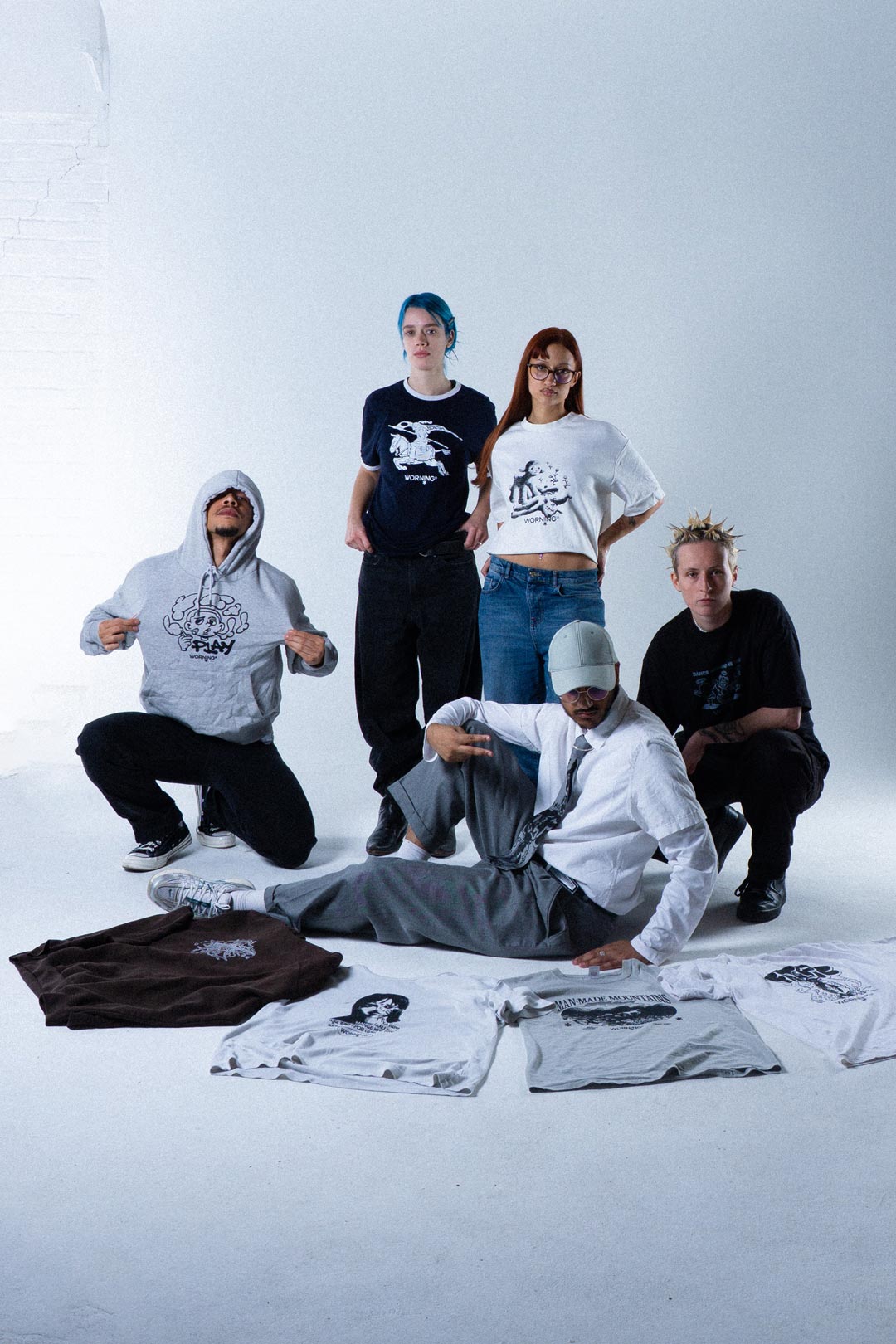
I rented a studio and cast both models and a photographer. The shoot followed a high-fashion direction infused with streetwear and punk influences: a clean, futuristic white backdrop and monochrome outfits that kept the focus on the printed designs.
To properly promote the brand, I created a dedicated Instagram account and produced over 50 posts, publishing almost daily to build reach and momentum.
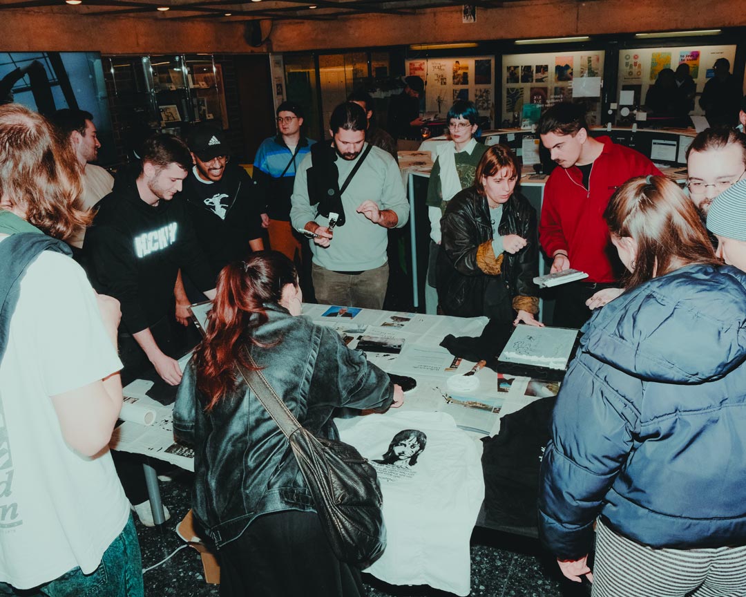
As a final highlight, I hosted a workshop at the Werkschau Mannheim to distribute the clothing and officially launch the awareness campaign. Participants brought their own garments, which I printed on-site.
I already have my own comic series. So what would be the next logical step? Exactly, my own fashion brand! But instead of a generic label, I wanted to create a brand with purpose and a forward-thinking concept. My roots lie in Bangladesh, one of the key countries in the fast fashion production. For a long time, I was a consumer of fast fashion myself. I never really questioned the low prices or production conditions until I started studying. As part of my master’s thesis, I created WORNING, a fashion project that draws attention to the injustices of the fashion industry, raises awareness, and encourages action. Instead of working purely theoretically, I wanted to create something hands-on as a creative balance to my corporate student job. WORNING is my final major design project before entering a full-time job. It was important to me to showcase my diverse design skills in graphic design, UX/UI, and brand design, while connecting themes like fashion, culture, and heritage.WORNING is cool, sustainable, shines a light on Bangladesh, spreads awareness in the streetwear scene and is filled with my own sick designs. What more could you want?